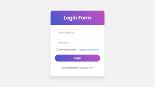
Hello readers, Today in this blog you’ll learn how to create an Animated Login Form with Floating Label Animation using only HTML & CSS. Earlier I have shared a blog on how to create a Responsive Chat Box Design and now I’m going to create a Login Form with Floating Label Animation.
A Login Form is a collection of credentials used to validate a user. Most often, these consist of a username and password. The login form is used by websites, computer applications, and mobile apps. A floating label is a text that appears inside the input field. When the user interacted with the input, the label “floats” above and making room for the user to input a value.
In this program (Login Form with Floating Label Animation), on the webpage, there is a Login Form with two input fields – Email and Password, a forgot password link, remember me checkbox, a button, and a signup link. When you focus on the input field, the label or text of the input float above. If you’re feeling difficult to understand what I am saying. You can watch a full video tutorial on this program.
You might like this:
Login Form with Floating Label Animation [Source Codes]
To create this program (Login Form with Floating Label Animation). First, you need to create two Files one HTML File and another one is CSS File. After creating these files just paste the following codes in your file.
First, create an HTML file with the name of index.html and paste the given codes in your HTML file. Remember, you’ve to create a file with .html extension.
Second, create a CSS file with the name of style.css and paste the given codes in your CSS file. Remember, you’ve to create a file with .css extension.
@import url('https://fonts.googleapis.com/css?family=Poppins:400,500,600,700&display=swap');*{
margin: 0;
padding: 0;
box-sizing: border-box;
font-family: 'Poppins', sans-serif;
}
html,body{
display: grid;
height: 100%;
width: 100%;
place-items: center;
background: #f2f2f2;
/* background: linear-gradient(-135deg, #c850c0, #4158d0); */
}
::selection{
background: #4158d0;
color: #fff;
}
.wrapper{
width: 380px;
background: #fff;
border-radius: 15px;
box-shadow: 0px 15px 20px rgba(0,0,0,0.1);
}
.wrapper .title{
font-size: 35px;
font-weight: 600;
text-align: center;
line-height: 100px;
color: #fff;
user-select: none;
border-radius: 15px 15px 0 0;
background: linear-gradient(-135deg, #c850c0, #4158d0);
}
.wrapper form{
padding: 10px 30px 50px 30px;
}
.wrapper form .field{
height: 50px;
width: 100%;
margin-top: 20px;
position: relative;
}
.wrapper form .field input{
height: 100%;
width: 100%;
outline: none;
font-size: 17px;
padding-left: 20px;
border: 1px solid lightgrey;
border-radius: 25px;
transition: all 0.3s ease;
}
.wrapper form .field input:focus,
form .field input:valid{
border-color: #4158d0;
}
.wrapper form .field label{
position: absolute;
top: 50%;
left: 20px;
color: #999999;
font-weight: 400;
font-size: 17px;
pointer-events: none;
transform: translateY(-50%);
transition: all 0.3s ease;
}
form .field input:focus ~ label,
form .field input:valid ~ label{
top: 0%;
font-size: 16px;
color: #4158d0;
background: #fff;
transform: translateY(-50%);
}
form .content{
display: flex;
width: 100%;
height: 50px;
font-size: 16px;
align-items: center;
justify-content: space-around;
}
form .content .checkbox{
display: flex;
align-items: center;
justify-content: center;
}
form .content input{
width: 15px;
height: 15px;
background: red;
}
form .content label{
color: #262626;
user-select: none;
padding-left: 5px;
}
form .content .pass-link{
color: "";
}
form .field input[type="submit"]{
color: #fff;
border: none;
padding-left: 0;
margin-top: -10px;
font-size: 20px;
font-weight: 500;
cursor: pointer;
background: linear-gradient(-135deg, #c850c0, #4158d0);
transition: all 0.3s ease;
}
form .field input[type="submit"]:active{
transform: scale(0.95);
}
form .signup-link{
color: #262626;
margin-top: 20px;
text-align: center;
}
form .pass-link a,
form .signup-link a{
color: #4158d0;
text-decoration: none;
}
form .pass-link a:hover,
form .signup-link a:hover{
text-decoration: underline;
}
That’s all, now you’ve successfully created a Login Form with Floating Label Animation using only HTML & CSS. If your code doesn’t work or you’ve faced any error/problem then please comment down or contact us from the contact page.
